
5 UI Design Principles I Always Follow
Every designer has their own way of approaching a project. Some start with colors, others begin by exploring layouts or collecting inspiration. Over time, I've realized that having a set of guiding principles helps me make better design decisions and maintain consistency across different projects.
These principles aren't strict rules—they're reminders that help me create interfaces that are not only visually appealing but also practical, intuitive, and enjoyable to use.
Here are the five UI design principles I rely on in almost every project :
1. Clarity Over Decoration
The first question I ask myself is simple:
Can users immediately understand what they're looking at?
A beautiful interface means very little if users struggle to navigate it.
Rather than adding unnecessary visual effects, I focus on making information easy to understand. Clear labels, recognizable icons, logical layouts, and meaningful hierarchy always take priority over decoration.
Good design should reduce confusion—not create it.
2. Consistency Creates Confidence
Consistency is one of the easiest ways to improve user experience.
When buttons, colors, spacing, and typography behave consistently throughout an interface, users naturally become more confident while interacting with the product.
That's why I always try to build reusable components and follow a simple design system from the beginning of every project.
Consistency not only benefits users, but also makes future design iterations much easier.
3. White Space Is Part of the Design
One of the most common misconceptions in UI design is that empty space is wasted space.
In reality, white space is what gives content room to breathe.
Proper spacing improves readability, separates related information, and guides users toward the most important actions without relying on excessive colors or visual effects.
Whenever an interface feels crowded, my first instinct isn't to add more—it's to remove unnecessary elements and improve spacing.
4. Design for Real Users
Design isn't created for Dribbble shots.
It's created for people.
Every decision should help users accomplish their goals more efficiently.
Before choosing colors or animations, I try to understand what users actually need, what problems they're facing, and how the interface can make their experience easier.
Beautiful visuals may capture attention, but usability is what keeps users engaged.
5. Keep Improving Through Every Project
No design is ever perfect.
Every project teaches something new.
Sometimes it's a better way to organize information.
Sometimes it's a simpler layout.
Sometimes it's learning that removing an element creates a stronger interface than adding another one.
I believe becoming a better designer isn't about chasing trends—it's about continuously refining the way we solve problems.
Every project is another opportunity to learn.
-
UI design is much more than arranging elements on a screen.
It's about making information clear, reducing complexity, and creating experiences that feel natural for the people using them.
These five principles help guide my decisions throughout every stage of the design process. While every project is different, the goal remains the same: designing products that are simple, thoughtful, and meaningful.

The Art of White Space
When people hear the term white space, they often think of it as empty or unused space. In reality, it's one of the most powerful tools in interface design. White space isn't about making a design look minimal—it's about giving content the room it needs to breathe.
Some of the world's best digital products, from Apple to Notion and Linear, rely heavily on generous spacing. Their interfaces don't feel premium because they use more elements; they feel premium because they know when to use less.
For me, white space isn't the absence of design. It's an intentional design decision.
White Space Directs Attention
Every element on a screen competes for the user's attention.
When everything is placed too closely together, users struggle to understand where they should focus first.
White space solves this problem by naturally guiding the eye.
Instead of adding larger buttons or brighter colors, proper spacing creates a clear visual hierarchy that helps users understand what matters most.
Sometimes the simplest way to make something stand out is to give it more space.
White Space Improves Readability
Spacing doesn't only affect layouts—it also affects text.
Paragraph spacing, line height, margins, and content width all influence how comfortable an article or interface is to read.
Even beautifully written content becomes difficult to consume if everything is packed together.
Good typography and good white space always work together.
One supports readability.
The other supports focus.
Minimal Doesn't Mean Empty
Minimalism is often misunderstood.
Removing elements simply to create empty space doesn't automatically improve a design.
Every decision should have a purpose.
The goal isn't to remove content—it's to remove unnecessary content.
When only the essential elements remain, users can focus on completing their tasks without distractions.
That's what makes an interface feel effortless.
Finding the Right Balance
Too little white space creates clutter.
Too much white space can make an interface feel disconnected.
The challenge isn't maximizing empty space—it's finding the right balance between content and breathing room.
As a designer, I constantly adjust spacing until the interface feels comfortable to scan, read, and interact with.
It's a small detail, but it has a surprisingly large impact on the overall experience.
So,
White space is one of the quietest elements in UI design, yet it has one of the strongest influences on how a product feels.
It improves readability, strengthens visual hierarchy, reduces cognitive load, and creates a sense of elegance that users immediately notice—even if they can't explain why.
Whenever I feel that a design looks busy or overwhelming, I rarely start by adding more.
Instead, I step back, simplify, and give the interface room to breathe.
More often than not, that's exactly what it needed.

My Favorite Figma Plugins
Figma has become one of the most powerful design tools available today. While its built-in features are already impressive, plugins can make the design process even more efficient by automating repetitive tasks and improving workflow.
Over the years, I've experimented with dozens of plugins. Some were useful for a while, while others became an essential part of my daily workflow.
These are the plugins I consistently use whenever I design websites, dashboards, or mobile applications :
Iconify
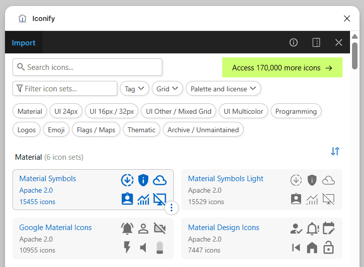
Finding icons from different libraries used to be time-consuming.
With Iconify, I can access thousands of icons from popular collections like Material Symbols, Heroicons, Phosphor, Lucide, and many more—all without leaving Figma.
Having every icon library in one place makes it much easier to maintain consistency throughout a project.
Whether I'm designing a dashboard or a mobile app, Iconify is usually one of the first plugins I install.
Content Reel
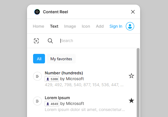
Designing with realistic content always produces better results than using placeholder text like "Lorem Ipsum."
Content Reel allows me to quickly insert names, email addresses, phone numbers, avatars, and company information into my mockups.
This helps me visualize how a design will actually look when populated with real content, making usability issues easier to identify early in the design process.
Unsplash
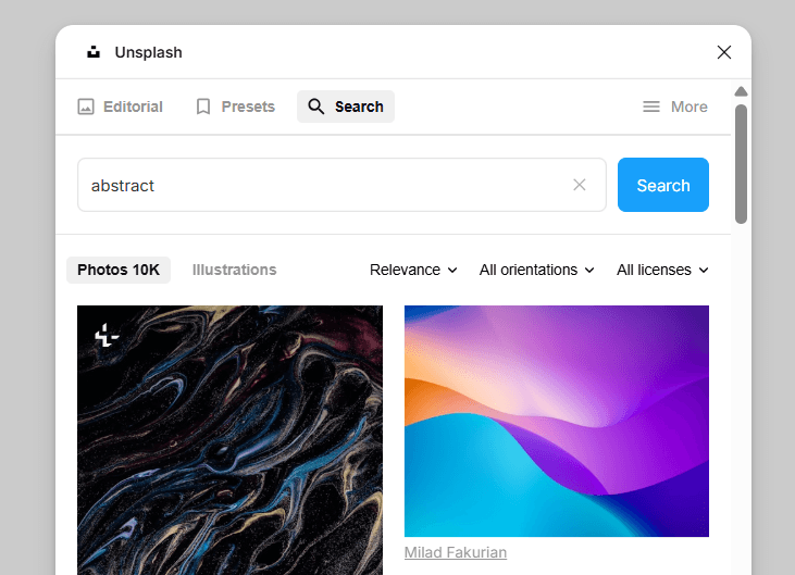
Every landing page or marketing website needs high-quality imagery.
Unsplash allows me to search and insert professional photos directly inside Figma without switching between browser tabs.
It's especially useful during the wireframing and concept stages, when speed is more important than sourcing final assets.
Blush
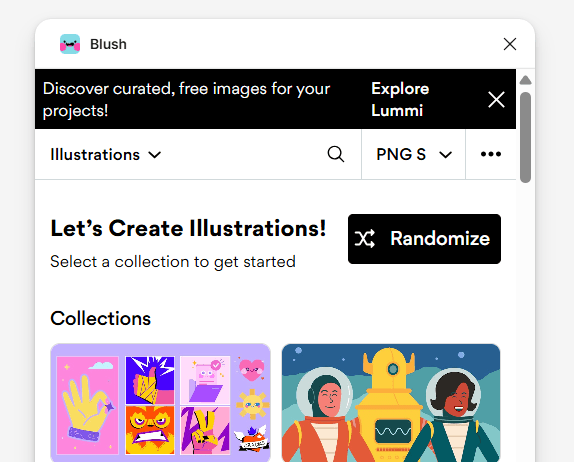
Not every project requires custom illustrations from scratch.
Blush makes it easy to create beautiful, customizable illustrations directly inside Figma. With a wide variety of illustration styles and editable elements, it's a great tool for adding personality to websites, onboarding screens, and empty states.
I often use Blush during the early design phase when I need high-quality visuals without spending hours creating custom artwork. It helps bring concepts to life while keeping the workflow fast and efficient.
Plugins Are Tools, Not Shortcuts
It's easy to believe that installing more plugins will automatically improve your designs.
In reality, plugins don't replace design thinking.
They simply remove repetitive tasks, allowing designers to spend more time solving real problems instead of performing manual work.
The best workflow isn't the one with the most plugins—it's the one that lets you focus on creating meaningful user experiences.
Every designer develops a unique workflow over time, and plugins naturally become part of that process.
The plugins I use aren't necessarily the "best" for everyone, but they've helped me work faster, stay organized, and spend more time on what truly matters: designing better experiences for users.
At the end of the day, great design comes from thoughtful decisions—not from the tools themselves.

Typography Matters
Typography is one of the most important elements in user interface design, yet it's often overlooked. Many designers focus on colors, illustrations, or animations, assuming those are what make a product visually appealing. While those elements certainly matter, typography is what users interact with the most.
Every headline, button, label, and paragraph contributes to the overall experience. Good typography doesn't just make an interface look better—it helps users understand information more quickly and navigate a product with confidence.
In my design process, typography is never an afterthought. It's one of the first foundations I establish before refining the visual details.
Typography Creates Visual Hierarchy
Users rarely read every word on a screen.
Instead, they scan the interface, looking for important information before deciding what deserves their attention.
This is where typography becomes essential.
A clear typographic hierarchy allows users to immediately distinguish between titles, subtitles, body text, and supporting information. By combining different font sizes, weights, and spacing, designers can naturally guide users through content without relying on unnecessary visual elements.
When hierarchy is done well, users don't need to think about where to look next—it simply feels intuitive.
Readability Comes Before Style
A beautiful interface loses its value if users struggle to read its content.
Choosing the right font size, line height, and spacing has a significant impact on usability. Comfortable reading experiences reduce cognitive effort and allow users to focus on completing their tasks rather than deciphering the interface.
Whenever I design digital products, readability always comes before decoration.
Simple, clean typography often creates a stronger experience than overly stylized fonts that sacrifice clarity.
Consistency Builds Trust
Consistency is one of the easiest ways to make a product feel polished.
Using too many font sizes, weights, or text styles can quickly create visual noise and make an interface feel disorganized.
Instead, I prefer building a simple typography system with clearly defined styles for headings, body text, captions, and buttons. Once these styles are established, they are reused consistently throughout the entire product.
Not only does this improve the user experience, but it also makes collaboration and future design updates much more efficient.
Typography Shapes Brand Personality
Typography communicates more than information—it communicates emotion.
Different typefaces create different impressions.
A modern SaaS platform may benefit from clean, geometric fonts that feel professional and reliable.
A creative portfolio might use more expressive typography to showcase personality.
Meanwhile, educational products often prioritize clarity and accessibility over visual experimentation.
Selecting the right typography helps reinforce a product's identity before users even begin reading the content.
Less Is More
One mistake I often see is using too many different fonts within a single project.
More fonts don't create more personality—they usually create inconsistency.
I prefer limiting a project to one or two font families and building variety through font weight, size, and spacing instead.
This approach keeps interfaces clean, cohesive, and easier to maintain as products continue to grow.
Typography Is More Than Choosing a Font
Many people think typography simply means selecting a nice typeface.
In reality, typography is about creating an enjoyable reading experience.
Letter spacing, line height, paragraph spacing, alignment, and content width all contribute to how users consume information.
When these details work together, the interface feels effortless.
Users may never consciously notice good typography—but they'll certainly notice when it's done poorly.
___
Typography is one of the foundations of great interface design.
It creates hierarchy, improves readability, strengthens brand identity, and helps users navigate digital products with ease.
For me, good typography isn't about making text look beautiful—it's about making information feel effortless to understand.
The best typography is often invisible. It quietly supports the experience without demanding attention, allowing users to focus on what truly matters.